Introduction
Complex problems are very hard to broach in design. Partly because the problems themselves have so many allies and facets. How do you design for that? To make that even harder, a magazine might have a set format that all articles must adhere to. So how can you express something that’s hard to design, hard to talk about, and hard to understand? This is something I tried to digest and figure out during my magazine project for my Design for Complexity class. Here, I used the complex problem, Psychological Non-Epileptic seizures or PNES. In the article, I attempt to explain the problem with humor and incorporate designs that are visual representations of the physical feeling of having a seizure. The challenge? How to design with a format that favors text rather than images.
CHALLENGES
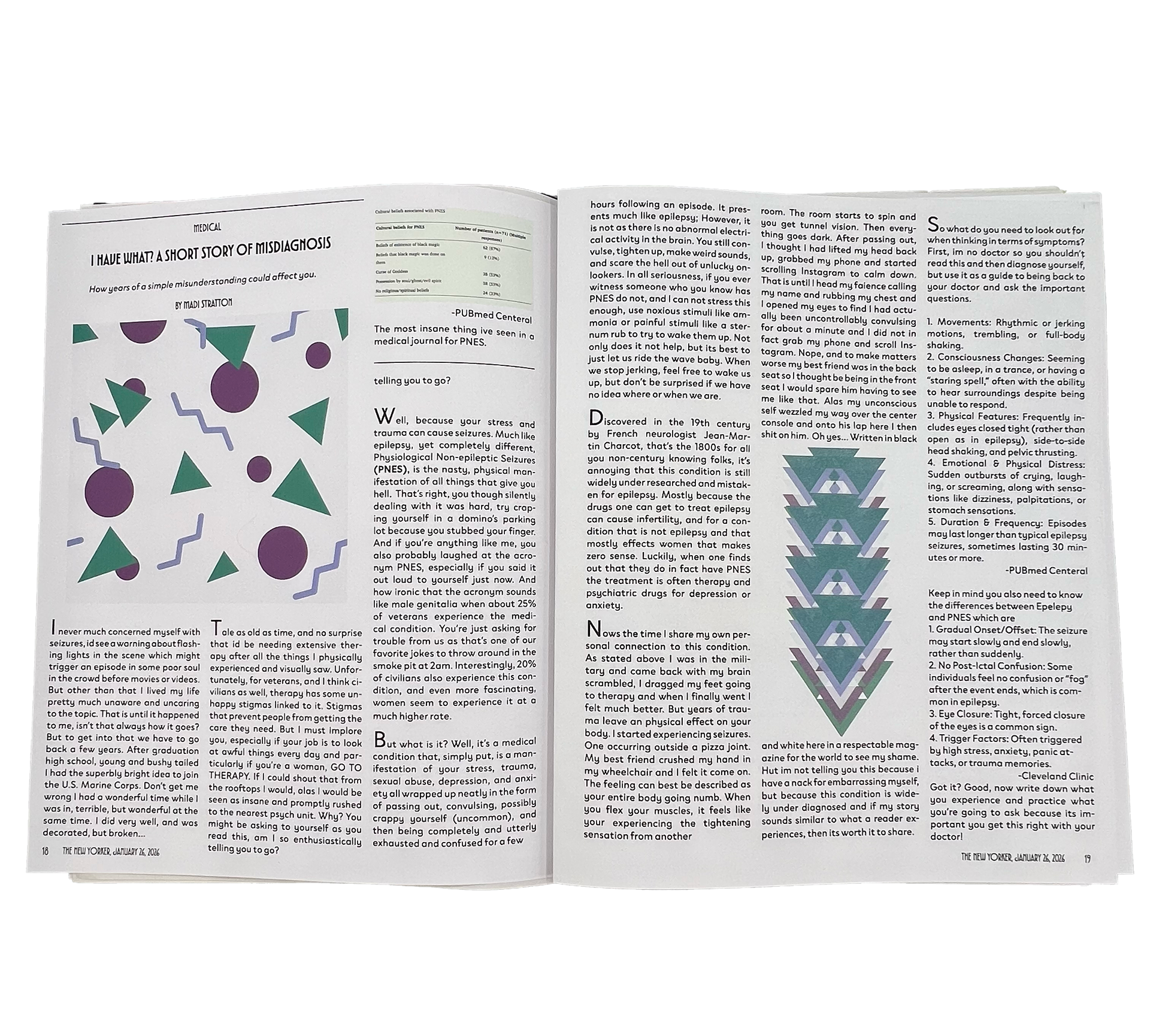
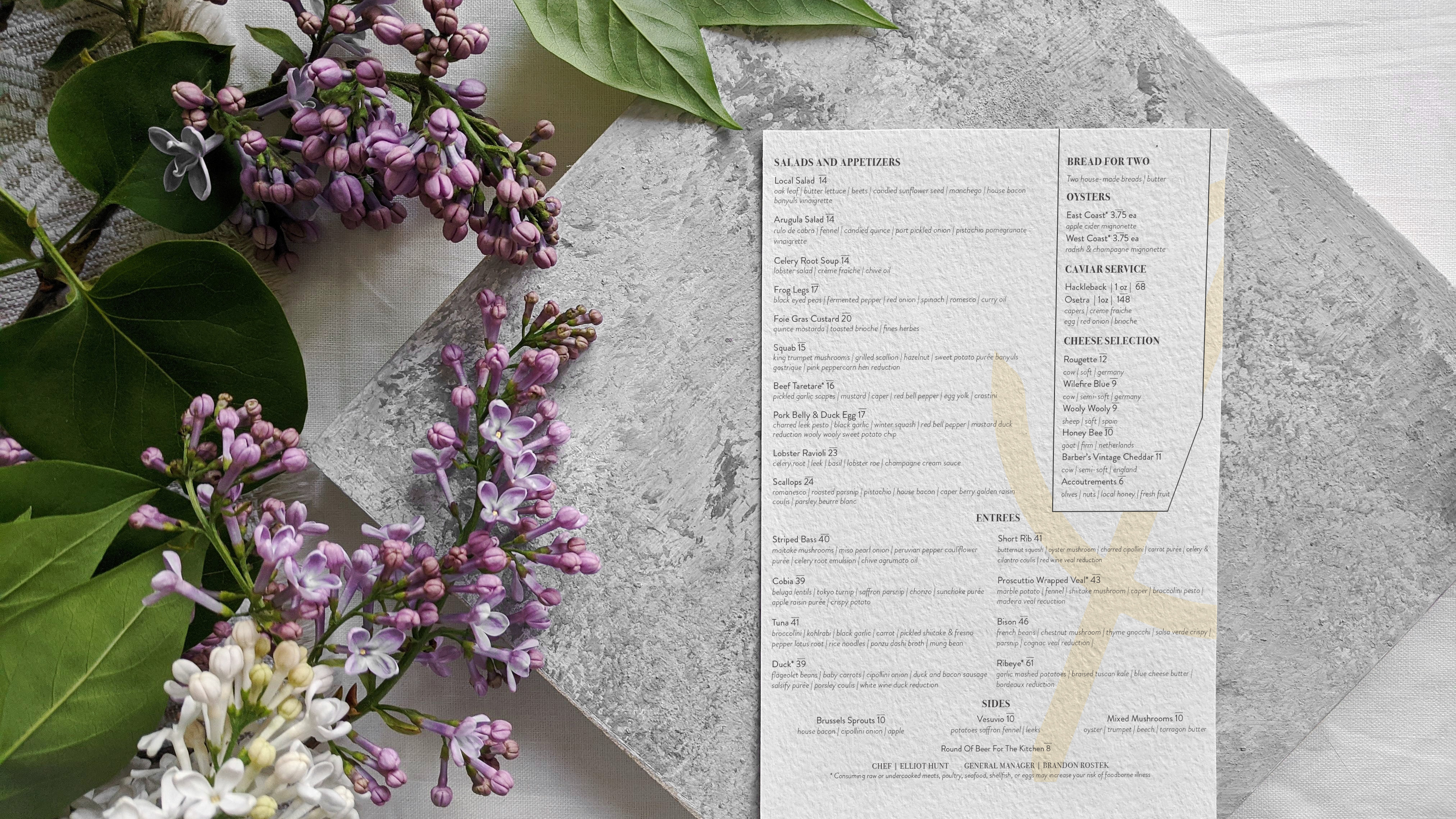
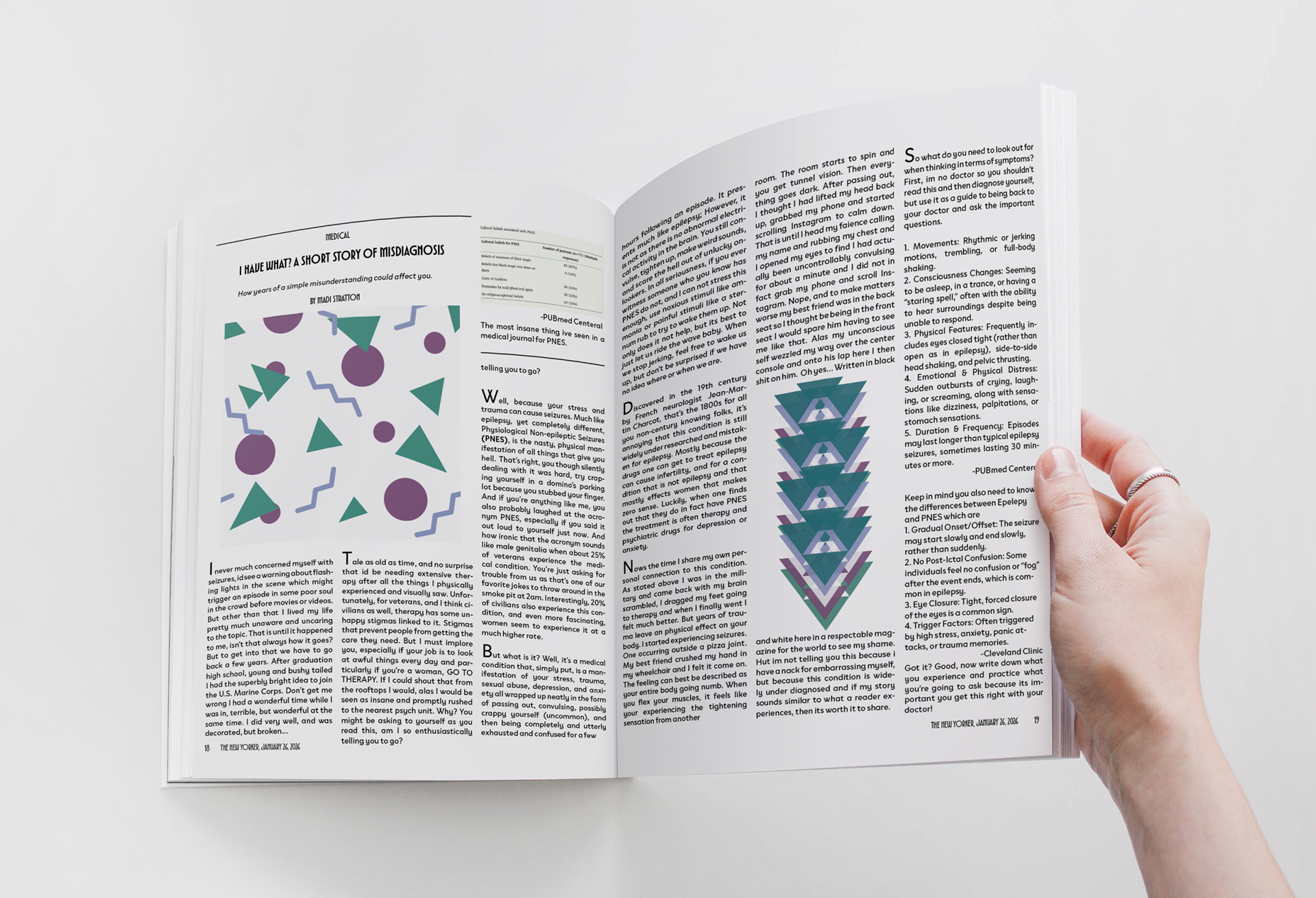
The biggest challenge was needing to design to the format of The New Yorker. This proved to be very difficult because it is not design heavy in terms of illustrations. Almost all of the illustrations are black and white throughout the pages I selected. I kept asking myself, “How in the world will I be able to capture the attention of the audience?”. I ultimately decided to add color; the colors chosen not only represent seizure awareness but also visually represent having a seizure. But that wasn’t enough to make it eye-catching. So instead, I wrote a comedy blog-style piece using swear words, as our brains are wired to spot them almost immediately. We have all been trained to have a reaction to them, so I sprinkled in a few.
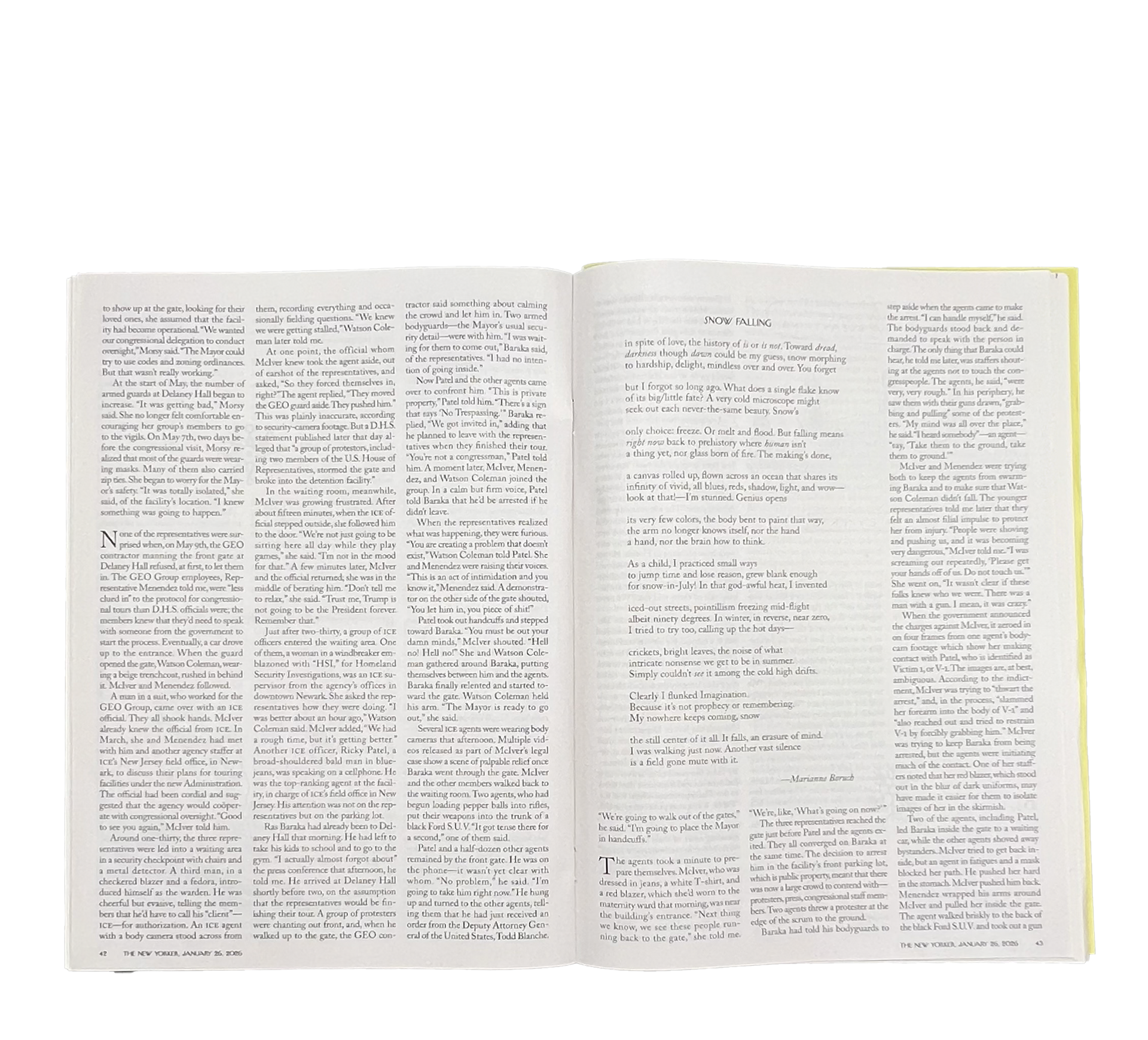
Example of how text heavy the New Yorker is.


WHY IT MATTERS
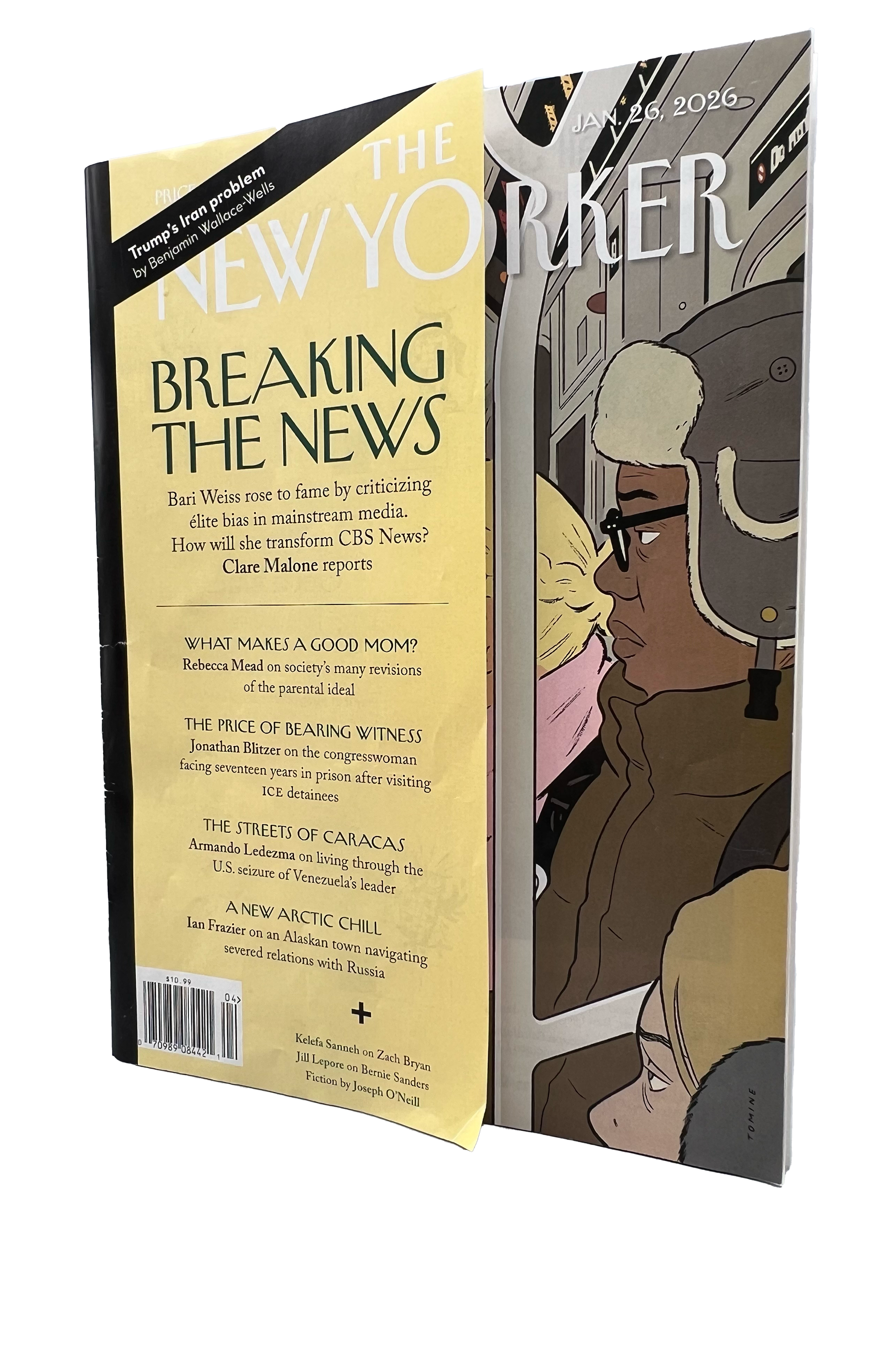
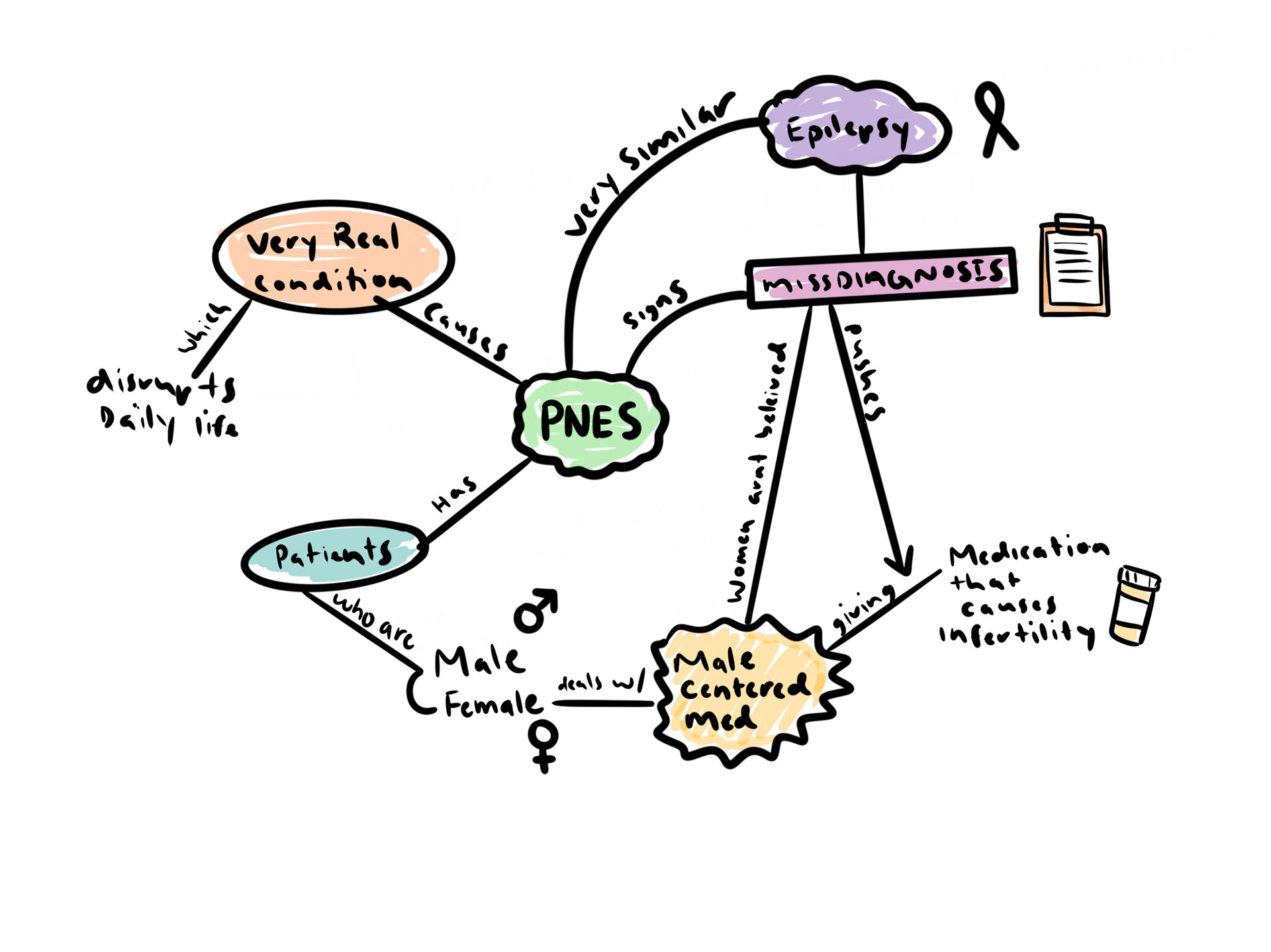
This topic matters because PNES is heavily under diagnosed and disproportionately affects women’s health. As explained in my article, PNES is often mistaken for epilepsy, and the medication prescribed to treat it can affect fertility and cause pregnancy complications. This is a major problem for women who plan to have kids one day. I find that every time I bring up PNES to a friend, I have to explain it like it’s a new thing, even though it's been around for a while. So this article aims to bring awareness to the condition in a way that’s personable, funny, and informative. I chose The New Yorker because of its audience. This magazine appeals more to the older generation, and I think it is important that they are also aware of this condition, as they are more likely to have been misdiagnosed in their life.
RESEARCH
When it came to the research phase, I looked at many academic journals that explain PNES and its effect on a person. Luckily, I also have first-hand knowledge, as I was also diagnosed, and that played a major role in how I presented the information. The data I looked at went over misdiagnosis, the proportion of women to men that are affected, and the symptoms and side effects of the seizures. This was ultimately very helpful to me as well, I didn’t seem to know as much as I had thought.
RESEARCH LINKS
https://my.clevelandclinic.org/health/diseases/24517-psychogenic-nonepileptic-seizure-pnes
https://www.epilepsy.com/diagnosis/imitators-epilepsy/psychogenic-nonepileptic-seizures
https://www.ncbi.nlm.nih.gov/books/NBK441871/
STORYTELLING AND STRUCTURE
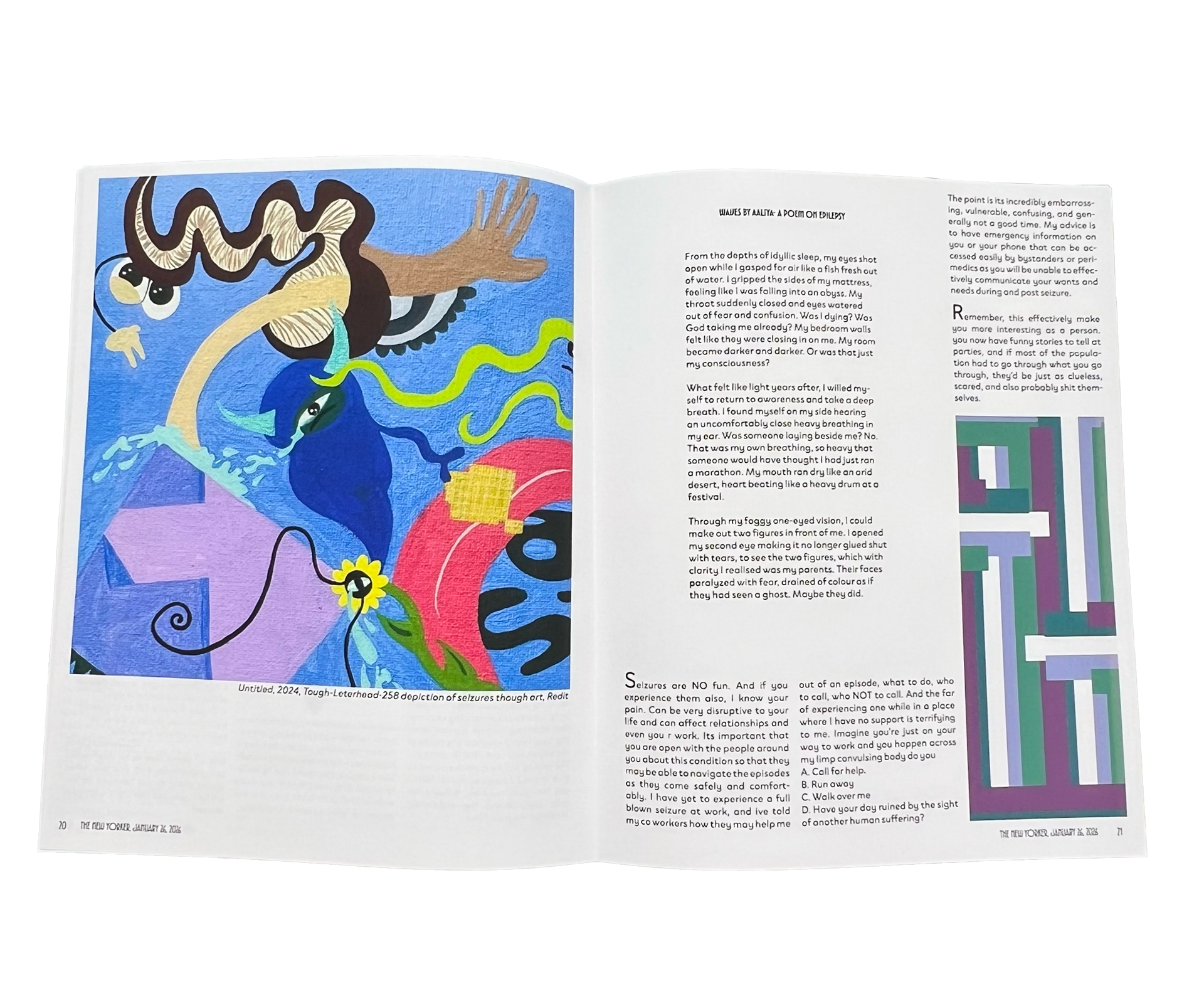
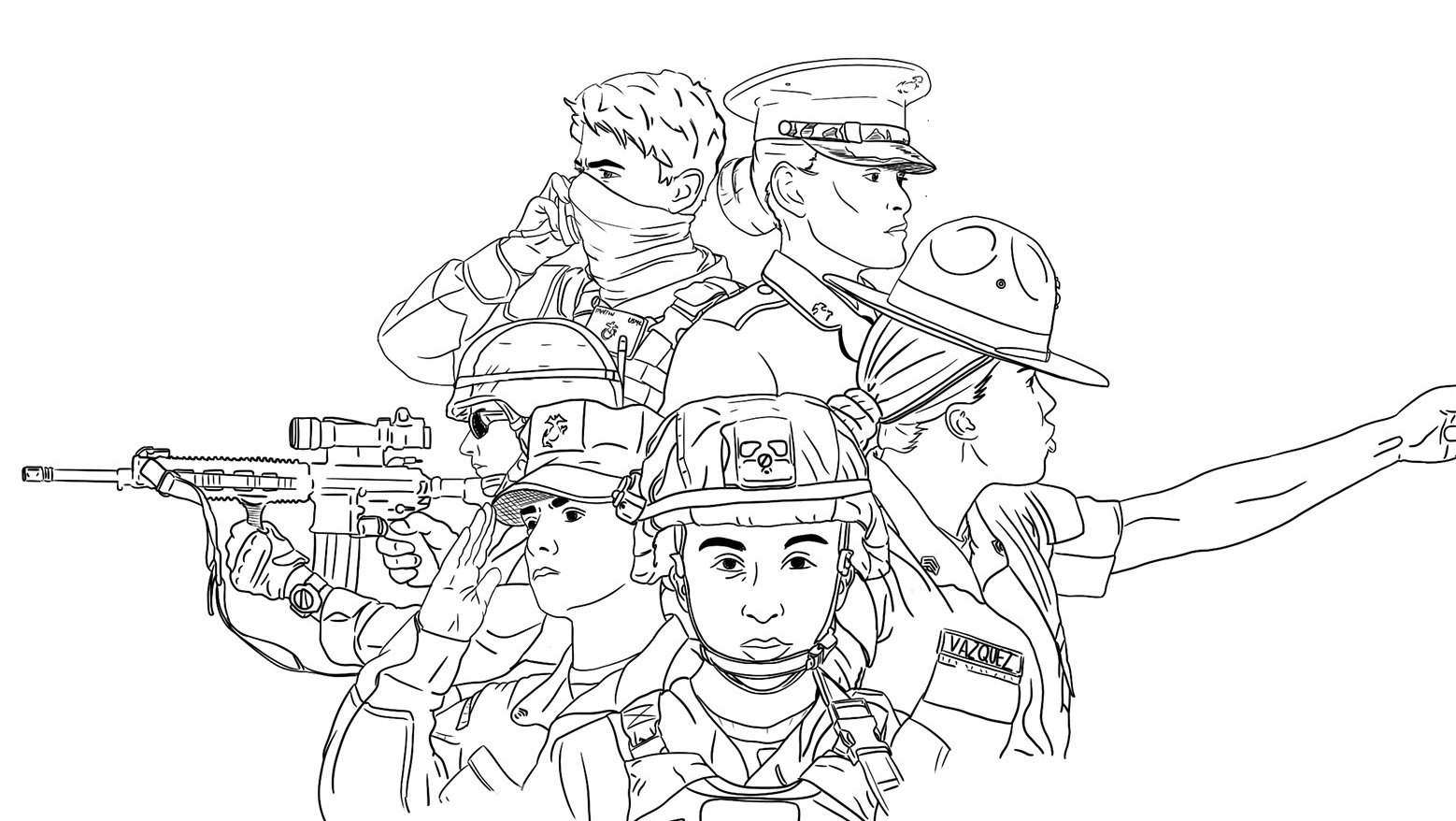
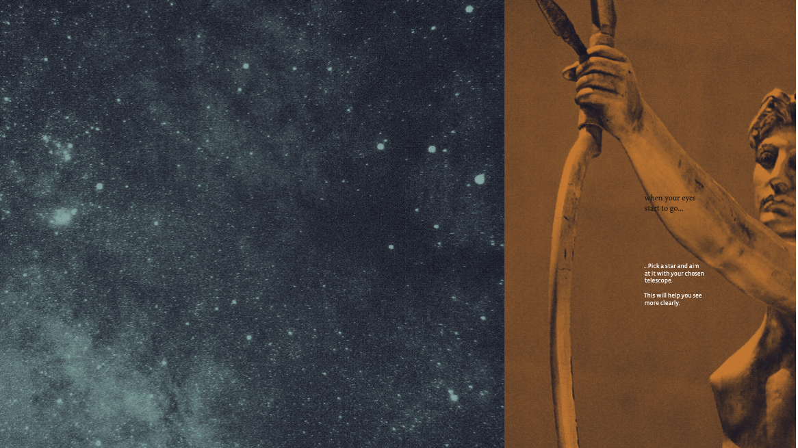
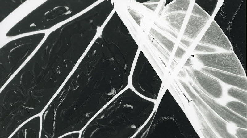
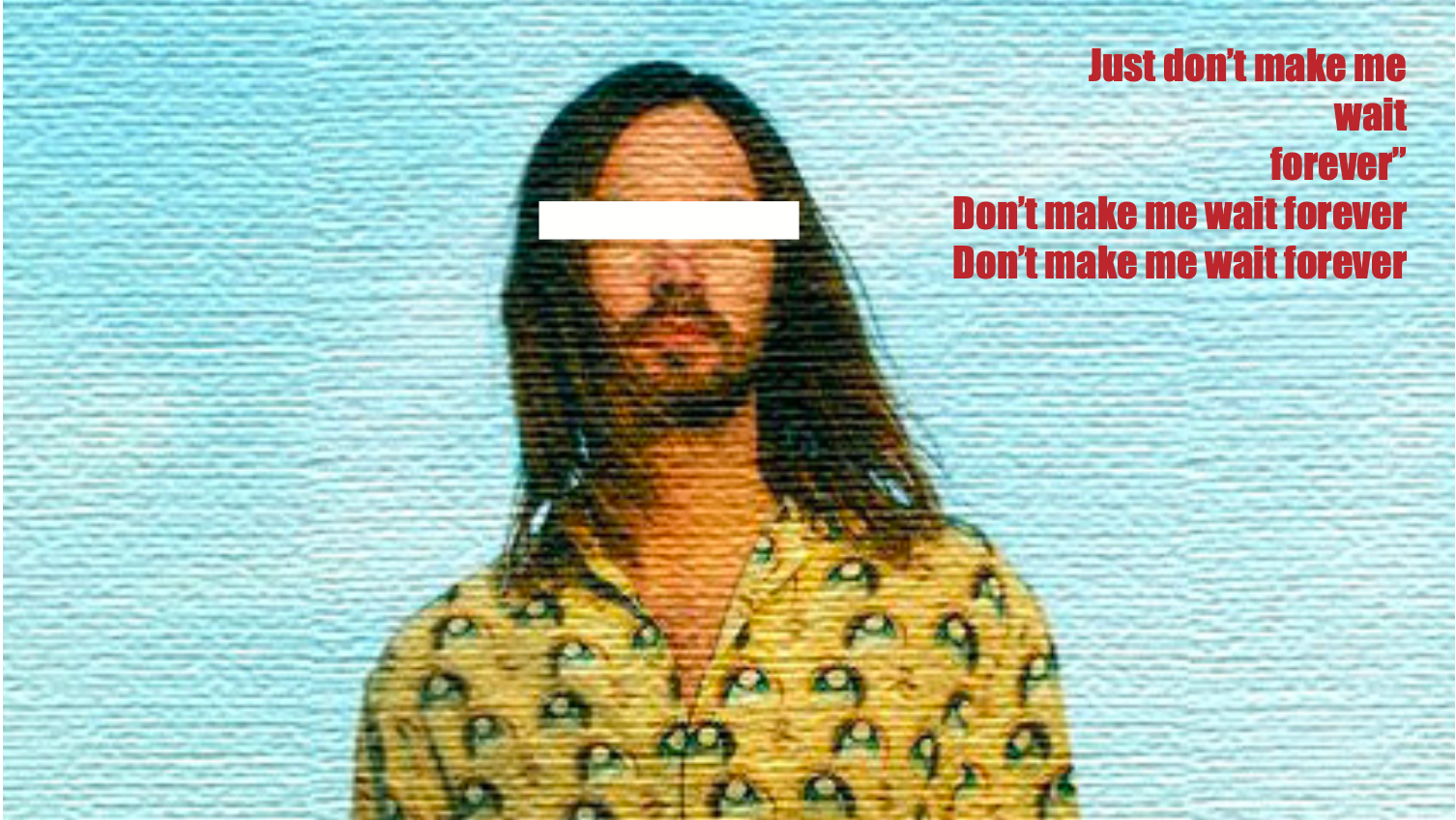
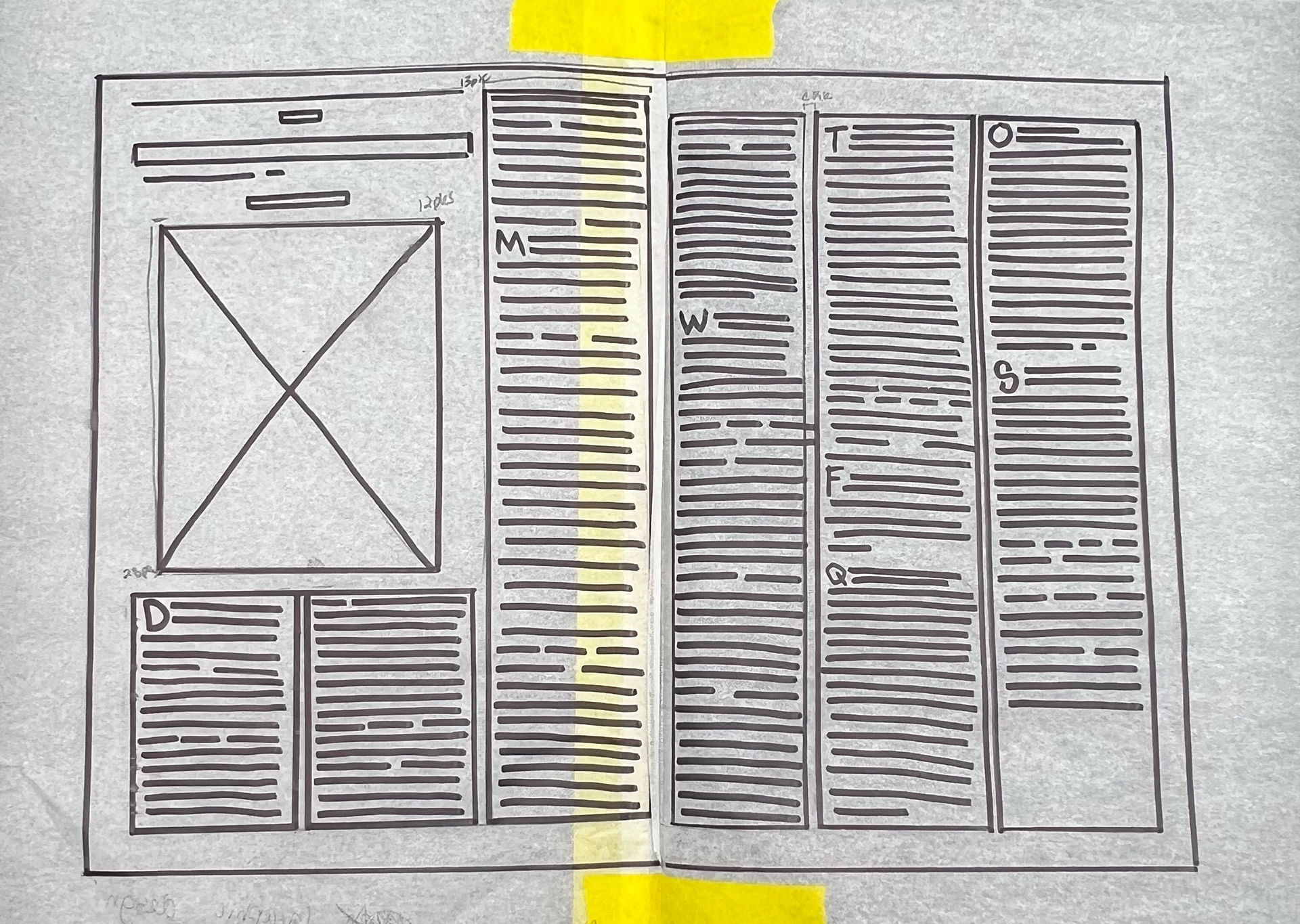
For the design, I continued the 3 column text, but I combined the spreads of a few pages. For instance, there was a double spread with a poem smack in the middle. I liked the idea of incorporating someone else’s experience into my story. I also added artwork from someone who was trying to visually represent what a seizure feels like. I felt that it was both interesting and would further the main text. I then created geometric patterns and placed them within the text to add variation and color, but also to visually represent how I feel a seizure looks. The process was really ‘put this all on the page and see how it feels’. I did a few drawings of the layout, but I wasn’t sure what it would ultimately look like, and I was trying to avoid visual overload.
VISUAL LANGUAGE
It took many refinement phases before I achieved the spreads I wanted. Color, visual breaks from text, incorporated works from other people, and research data improved the overall layout and supported my text. Although the design format of the New Yorker is brutal and text-heavy, I felt designing in this format was successful with the small changes I decided to incorporate.
OUTCOME
I've learned a lot, and I regretted a lot, but that’s what makes designing for complexity fun and challenging. In hindsight, I would have chosen a different magazine to explore more visual design methods. However, I found that working in such a text-heavy, illustration-lacking, tight format space was what this project was about. It would be much easier to have a clean slate, so to speak, with complete control over format; however, that defeats the purpose. I found that pushing formats ever so slightly can make a more dynamic story, but also challenge social norms in the way we present stories through language when reading a magazine article.